Data Analysis with ChatGPT
ChatGPT can be a powerful tool to analyze data and create data visualizations. ChatGPT-4, the newest family of models from OpenAI, is preferred for data analysis. ChatGPT-3.5 has some data analysis capabilities as well, but it is limited to writing data analysis code that the user must run for themselves to perform the analysis. Three ways to get started with data analysis in ChatGPT-4 are included below.
For these exmaples, we will be using a custom GPT. If you are not sure what a custom GPT is or would like to build your GPT visit this basic introduction. If you are not sure how to get started with ChatGPT, learn more about prompt engineering strategies.
This tutorial will explain how to perform simple data analysis on large sets of external data. For this example, we will use the following dataset, showing worldwide videogame sales for the year 2017, to demonstrate data analysis in ChatGPT. Here is a sample of the data:

Note: Sales are in millions.
If you would like to follow along, download the dataset here, or choose any other large dataset to begin with. To begin, open ChatGPT and select "Explore GPTs" on the left sidebar. Next, search "data analyst". There are many GPTs that excel in data analysis. In this example, we will start a new chat with the "Data Analyst" by ChatGPT pictured below.

Once you have started a chat with a GPT, upload the dataset file and prompt the GPT to create visualizations on the data. For example, we prompted the GPT by saying, "I want to make a visualization on Genre and Global_Sales."

Additionally, GPTs can create specific types of graphs to best illustrate trends in the data. You could ask for a pie chart or a line chat that represents the data. GPTs excel at accommodating any style requests for visualizations.

GPTs are also capable of creating more complex visualizations, like heatmaps. We asked the GPT, "What data would you suggest visualizing with a heat map?" ChatGPT provided a list of ways to use heatmaps to visualize a dataset. Prompts to the GPT can include any specific columns that you want to ensure that the GPT analyzes.
In this example, we will ask for a heat map that compares sales by Region and Genre, using the following prompt: "I want to see the general spread of sales across each region by genre. Create a heat map that displays how different genres perform across various regions."

ChatGPT easily creates the graph. Another example of a prompt we could provide to the GPT is "Visualize the data from North American sales. Compare the sales of different genres in North America using a bar graph, box plot, and any other charts that might help." ChatGPT created 2 different visuals based on this prompt.


GPTs will also sometimes suggest additional visualizations as you interact with the data. This can be helpful if you have an unfamiliar or extremely large dataset.

While data analysis GPTs are programmed extremely well, there will still be times where the output does not match the desired input perfectly. Here are some examples of times when the generated visualizations were not quite what was envisioned.


ChatGPT isn't always perfect at data analysis, but it's a great way to get started. Note that each graph that ChatGPT generates has a button that will show its code and other information about its formatting. This allows you to copy the code that seems useful and use it outside of ChatGPT.


Categorical data analysis focuses on data that is divided into discrete groups. Examples of categorical variables include genre, gender, nationality, and marital status. For these examples, we will use the following data, introduced in the "Simple Data Analysis" tutorial, to explore categorical data analysis.

If you would like to follow along, download the dataset here, or choose any other large dataset to get started with. To begin, open ChatGPT and select "Explore GPTs" on the left sidebar. Next, search "data analyst". There are many other GPTs that excel at data analysis but for this example we will use "data analyst" by ChatGPT which is generally the first one on the list.
The categorical variables in this example dataset include Platform, Genre, Publisher, Rating, and Critic Score. ChatGPT can calculate frequencies and proportions based on the variables in any given data.
Frequency/Count
To find the frequency of each Genre we used the prompt: "Give me a count for games per genre."

This created a clear chart with counts for each category, however, the titles were incorrectly placed. Users can follow up with additional constraints to ensure that the data is presented in the desired way. If there are columns that need to be adjusted select the column and it will turn blue (see above). The user could then provide the prompt by stating, "change the heading of this column to Genre and the other column to Counts."

Proportions
ChatGPT can do both simple and complex proportional analysis. To demonstrate its ability to do complicated analysis,We asked "What is the proportion of critic score classes within each genre?"

If a chart would be more helpful, another example of a prompt is "Can you visualize this in a graph?" Your output may look similar to the following:

Cross-tabulation and Graphical Representation
ChatGPT can also assist the user with understanding how variables are connected. In this example we will seek to understand how rating and genre are connected. We will employ the following prompt: "Analyze the relationship between rating and genre of video games."

In this case, ChatGPT first provided a cross-tabulation, a statistical comparison of two or more variables between the categories. It then created an interactive stacked bar chart with a descriptive analysis below.
You can easily create a crosstab chart like this one. One example of how to do so is with the following prompt: "Create a crosstab chart that analyzes the relationship between rating and genre."

ChatGPT is capable of creating many types of visualizations including a grouped bar chart, heatmap, stacked bar chart, mosaic plot, pie chart, or almost any other type of graph.
Comparative Analysis
ChatGPT is also capable of comparative analysis. One example of a prompt to do so is seen in the following example:
"Conduct a comparative analysis comparing the average sales figures for games in each genre to see which genres are more commercially successful."

In our example, ChatGPT creates a visual that shows the average sales by genre and region. It is easy to have ChatGPT make additional tweaks to the chart, after its orignal creation. For example we asked ChatGPT to "Do it again but exclude global sales. Also, make the color palette dark blues."

Some other helpful visuals for categorical analysis are tree maps, sunburst charts, Sankey charts, and stacked bar charts. For some of these, ChatGPT will create a link to the chart rather than embedding it directly in the chat.
ChatGPT uses HTML to create advanced charts. When you click the download button to download these graphs, they will save as an interactive HTML file by default. To save them as an image, hover over the visual and click the camera button that appears at the top right.


Correlation
ChatGPT can also perform more advanced types of statistical analysis, such as chi-squared tests. Chi-square tests determine if there is an association between different categorical variables. An example of doing so is seen in the following prompt: "Do a chi-squared test to determine if a platform is dependent on the genre or vice versa."
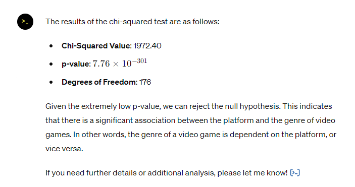
If you ever want to see or copy the code that ChatGPT generates to perform its calculations or display visualizations, click the blue code arrow at the bottom of the output.
![[>_] Click on the blue symbol similar to this one to see the code behind the analysis.](https://brightspotcdn.byu.edu/dims4/default/f37752e/2147483647/strip/true/crop/634x176+0+0/resize/634x176!/quality/90/?url=https%3A%2F%2Fbrigham-young-brightspot-us-east-2.s3.us-east-2.amazonaws.com%2F9c%2Ff1%2Fef9ec6414c22aba4bbda484991ce%2Fscreenshot-2024-05-16-094517.png)
The goal of sentiment analysis is to detect the emotional tone of digital text. Text can be categorized as positive, negative, or neutral. Companies often perform sentiment analysis on customer reviews and social media comments to determine how their products are being received. ChatGPT can be very useful in performing sentiment analysis.
Sentiment analysis generally involves a large sample of text. For this demonstration, we will use this list of Twitter posts.
For these examples, we will use another custom GPT as seen in the Simple Data Analysis and Categorical Data Analysis sections. There are many other custom GPTs specifically designed for text analysis. To find such GPTs, go to ChatGPT, navigate to "Explore GPTs", and search for the appropriate GPT. In this example we will use the "Text Mining" GPT seen below.

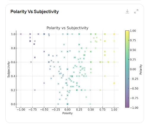
To begin conducting sentiment analysis, users must upload the dataset in the chat. In this example, we do so and then prompt the GPT by saying, "conduct a sentiment analysis of this data." ChatGPT may create a chart that analyzes each tweet's polarity and subjectivity. Polarity is the overall sentiment expressed on a scale of very negative (-1) to very positive (+1). Subjectivity is on a scale of completely objective facts (0) to completely subjective opinions (1). These scores represent one way to qualify the sentiment of text.

Sentiment Mining
Since sentiment analysis generally categorizes text as positive, negative, or neutral, another way to analyze the data would be using sentiment mining. In this example, we state "Add a new column to the original data that analyzes each comment in the Text column as either positive, negative, or neutral."

ChatGPT may not be perfectly accurate in categorizing each tweet, but over a large dataset, it should give fairly accurate results.
GPTs are also advanced enough to detect subtle nuances in text. For example, we could test whether the GPT can also measure sarcasm.

Visualization
GPTs can also create graphs to visualize the results of our sentiment analysis. Here is an example prompt to do so:
"Create a bar graph that shows the count of each sentiment category (positive, negative, and neutral)."

ChatGPT color codes the graph in the traditional green and red for positive and negative, but you can always tweak the color scheme as needed. One example of this is done by saying:
"Recreate this graph where positive is blue, negative is black, and neutral is grey."
The following are additional visualizations of this data and the prompts that were used to create them.
"Create a histogram showing the distribution of polarity scores." or "Create a histogram showing the distribution of subjectivity scores."

"Create a scatter plot illustrating the relationship between polarity and subjectivity."
"Create a pie chart that demonstrates what percent of the tweets are sarcastic vs serious."

Article Analysis
ChatGPT can also perform analysis on articles. One example of doing so is by asking the GPT to "Conduct a full sentiment analysis of this article."
You could also ask, "According to this article, how do students at BYU feel about generative AI?" Each of these prompts results in an in-depth analysis that provides evidence from the text to respond to your query.
After finding specific results, you can graph those results as mentioned previously. For example we said, "Create a donut chart that represents the above analysis."
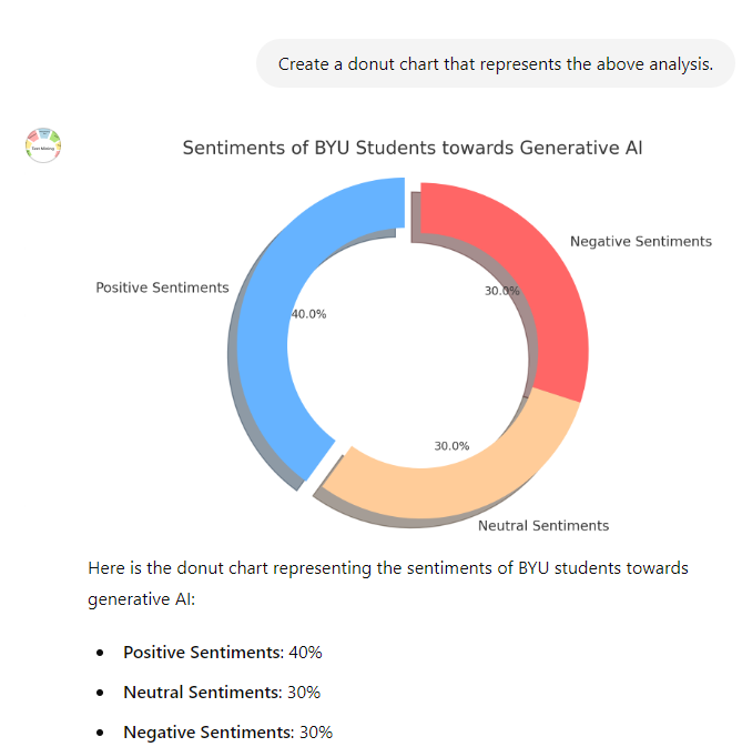
ChatGPT quickly created a visually appealing chart to demonstrate the sentiment of the article. These same steps can be completed with other articles or papers to explore how ChatGPT can be a tool for sentiment analysis.